Nabihah Hossain
Plugged
Exploring UX methods to streamline the job application process for diverse applicants
INTRODUCTION
Client: Plugged — uses powerful artificial intelligence that empowers organizations in the world to recruit the best diverse talent. The client aims to create a platform connecting students, recruiters, and career service professionals to improve the on-campus diversity recruitment experience.
Time Constraint: 3 weeks
Brief: For this project, the client provided our team of three UX designers to create a mobile application that streamlines the job application process for diverse students.
Goal: Provided the brief, our team set out to create an app for diverse young professionals that allows users to apply to jobs and sign up for networking events with just a swipe by providing them efficient access to relevant opportunities, which facilitates their job search and helps them find that perfect job more quickly.
RESEARCH & KEY FINDINGS
Using primary and secondary research methods to guide design process
User Survey
Our team used an online survey to target diverse young professionals in their last year of school (or recently graduated) who are navigating their job search. We recruited participants from the online survey as well as from our own networks for user interviews in order to understand what tools diverse professionals use to figure out pain points in their job search process.
User Interviews
Our team interviewed users (age 18–25) in college (or recently graduated) who are looking for a job or have recently started a new position after a long search process.
User Interview Questions:
How do you feel when you think about your job search process?
What tools are you using to navigate your job search?
How comfortable or prepared do you feel about your job search?
What kinds of resources are lacking in your job search process?
Describe the main obstacles you face in your job search and how you overcome them.
Key Findings:
Users feel overwhelmed and lost when it comes to looking for a job, especially when they are looking for their first job
Users feel unmotivated and hopeless if they don’t get feedback in the process or don’t hear back from companies
Users take advantage of LinkedIn and feel that they need to have a profile to get noticed or make connections
Users feel self-conscious if they do not have the most impressive past experiences on their LinkedIn/Resume
Users think they might face unfair explicit/implicit bias regarding race, gender, past experience, educational institute during the hiring process
Competitive Analysis
Using a SWOT analysis to assess the strengths, weaknesses, opportunities, and threats for the platform
SWOT Analysis for Plugged
Comparative Analysis
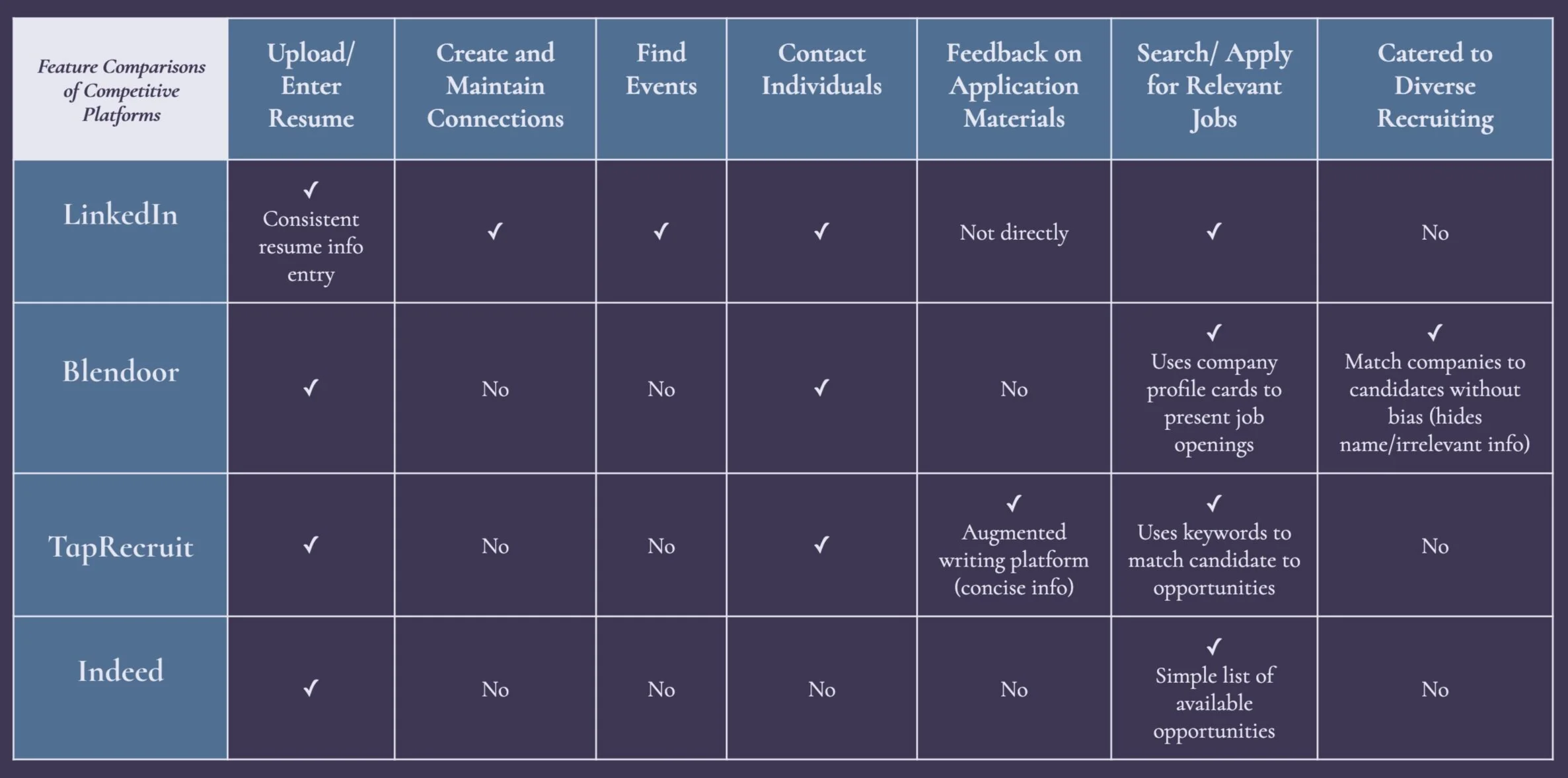
Assessing competitive features to find potential opportunities to integrate and improve the job search process
Feature Analysis • Comparing different features of direct competitors
USER PERSONAS & SCENARIOS
Creating user personas and storyboards to guide design thinking
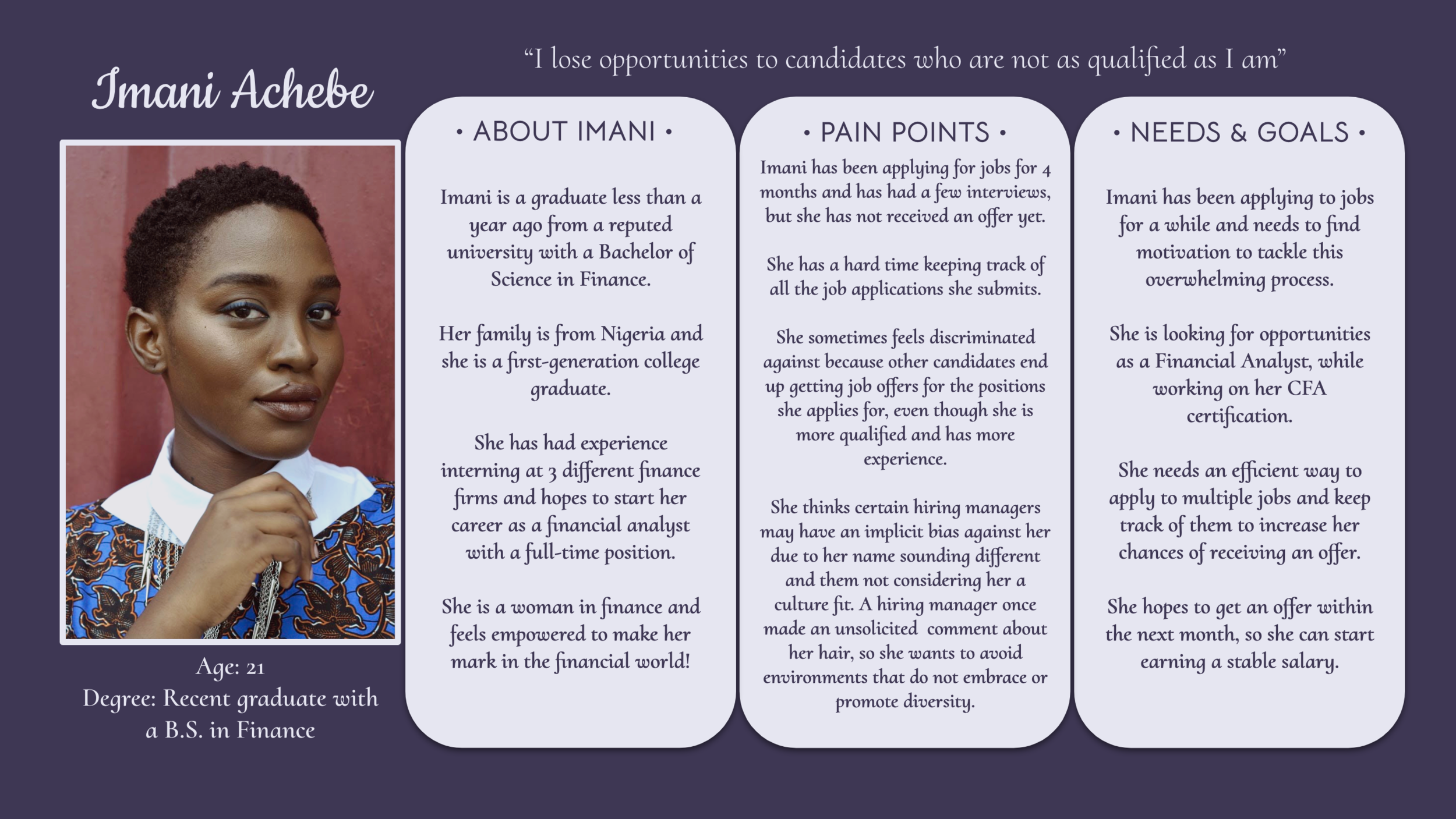
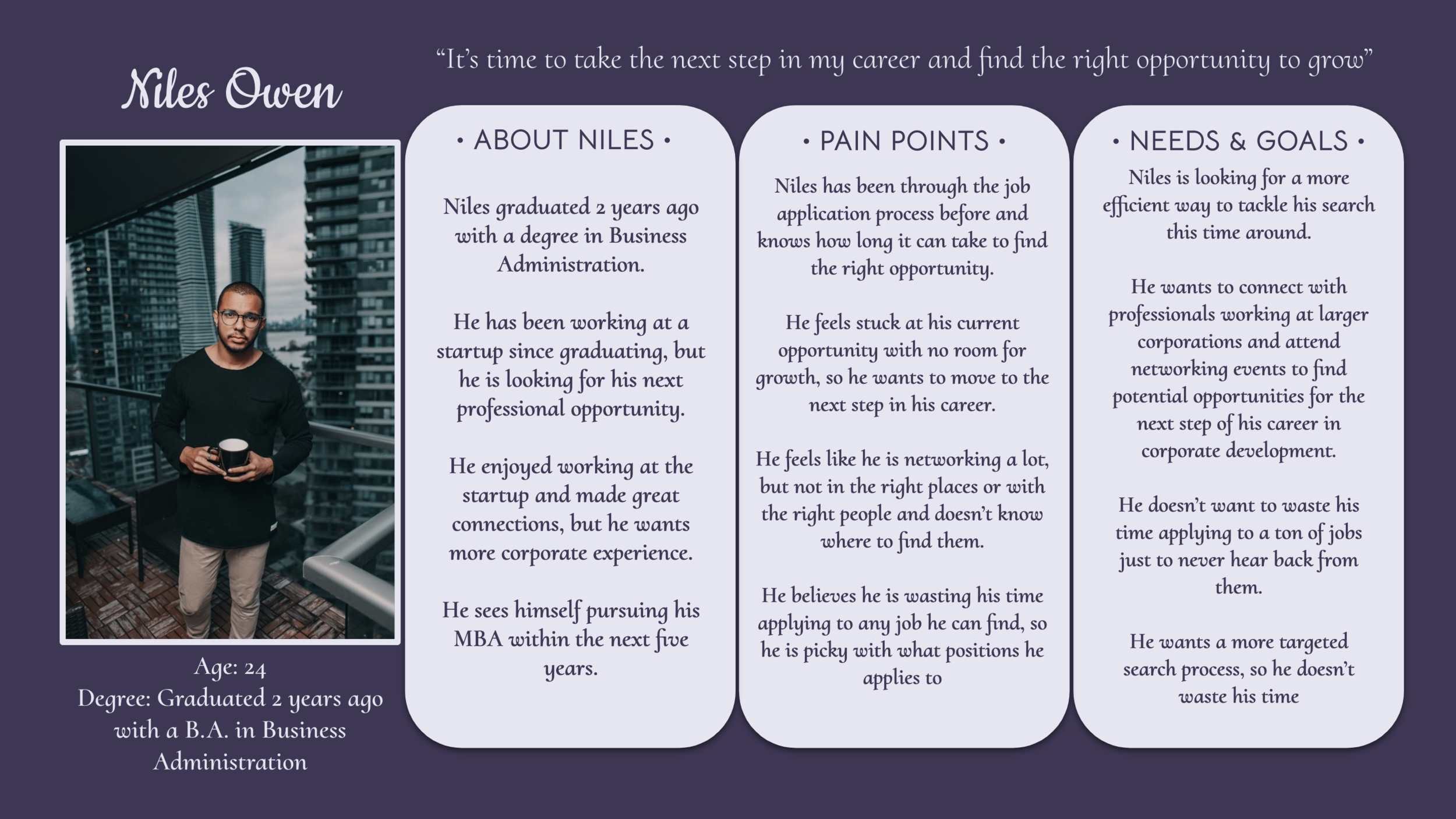
Using the research gathered from the user interviews I conducted, I created the following user persona profiles to encompass the major pain points, needs, and goals of our potential audience.
User Persona Profiles
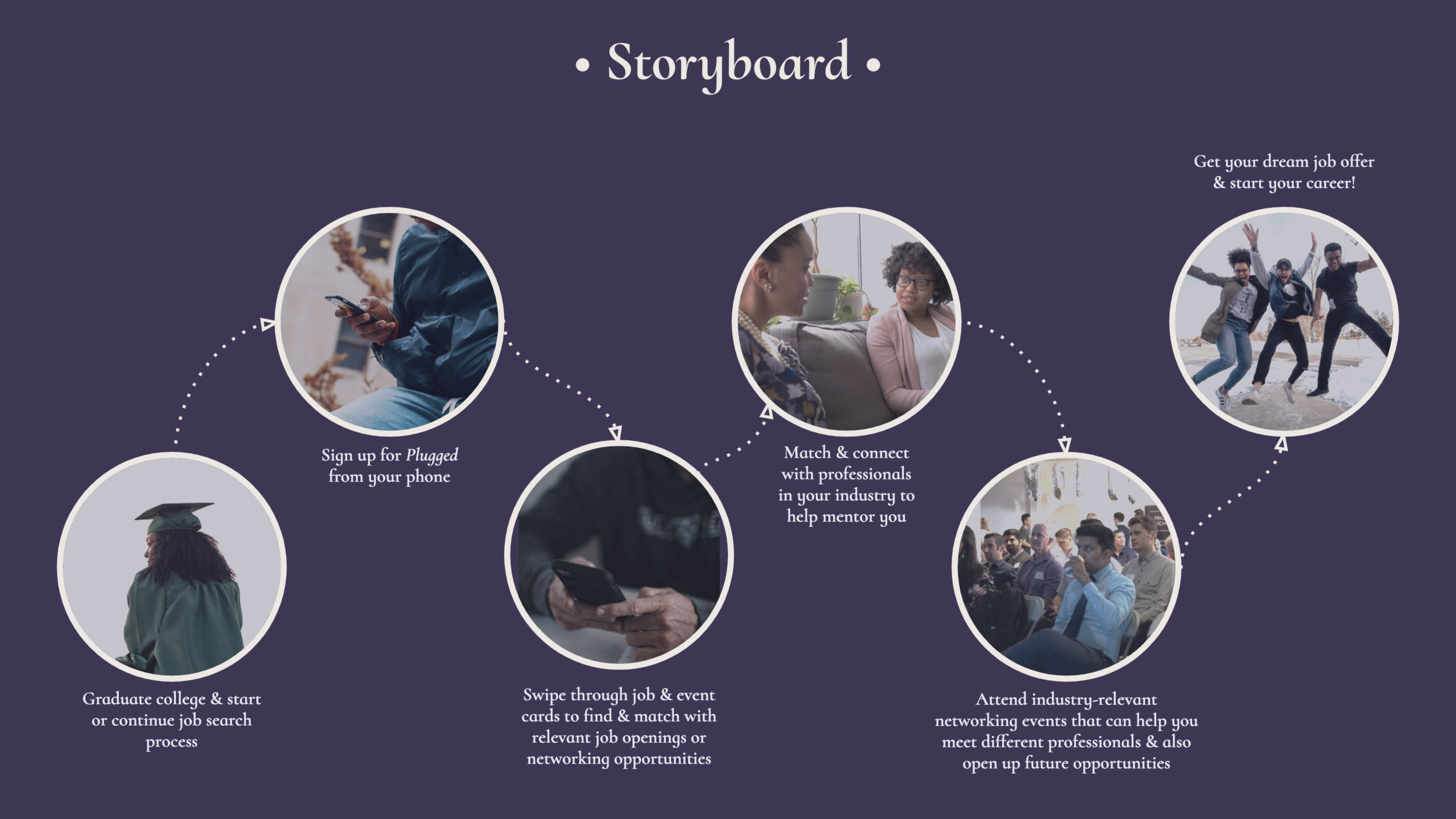
User Scenario
Based on the user personas, I created a storyboard to illustrate the user experience of using Plugged as a job search platform
INFORMATION ARCHITECTURE & WIREFRAMES
Creating sitemaps and wireframes to guide high-fidelity mockup of product
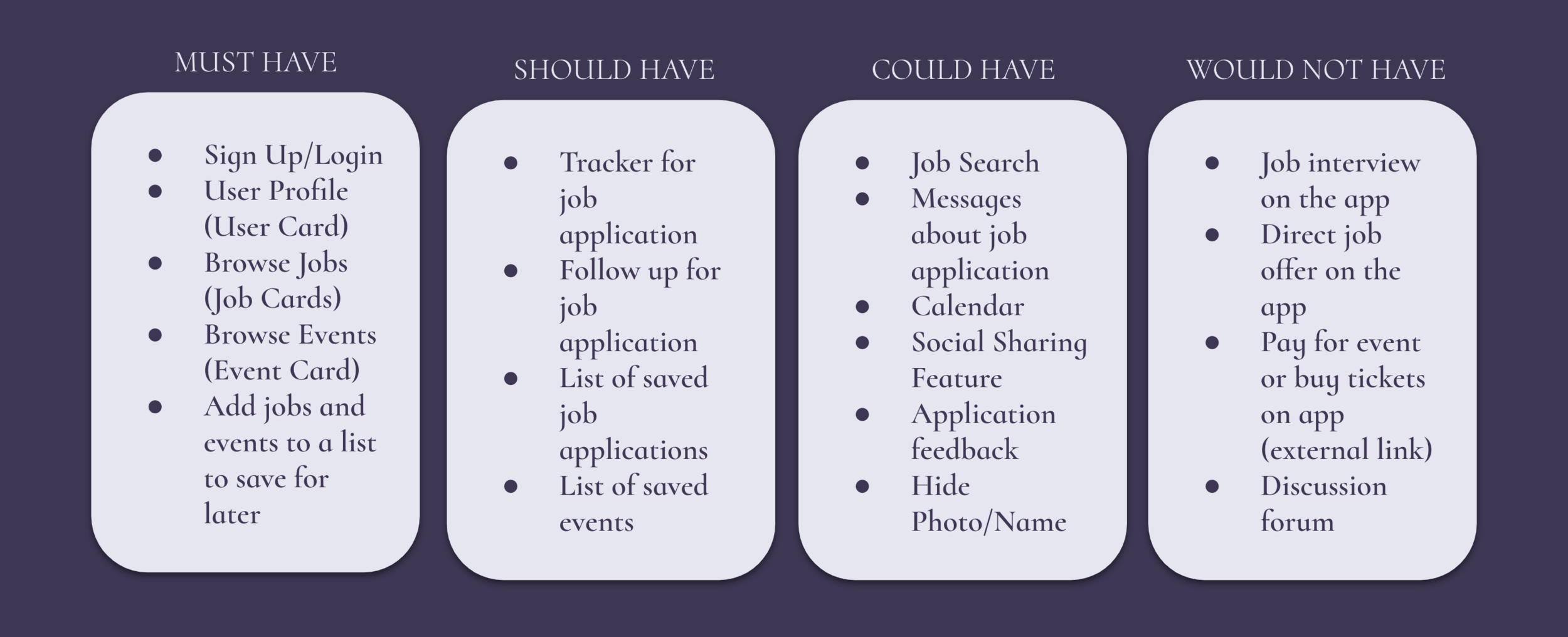
Prioritization Technique: MoSCoW
Determining the features our product must have, should have, could have, and would not have to prioritize what we include in our minimum viable product (MVP).
Information Architecture
Using card sorting to determine navigation & sitemap
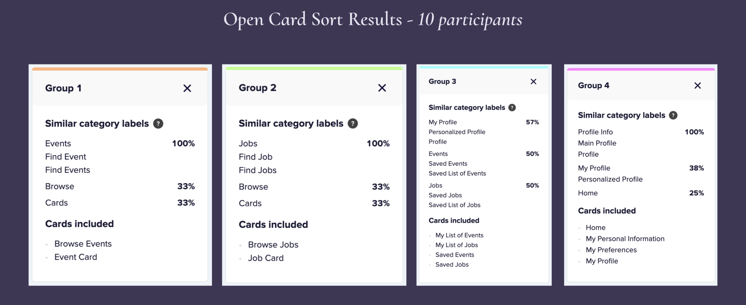
Open Card Sort:
In order to determine the information architecture and sitemap for our application, we used an open card sort to understand how users would group different categories.
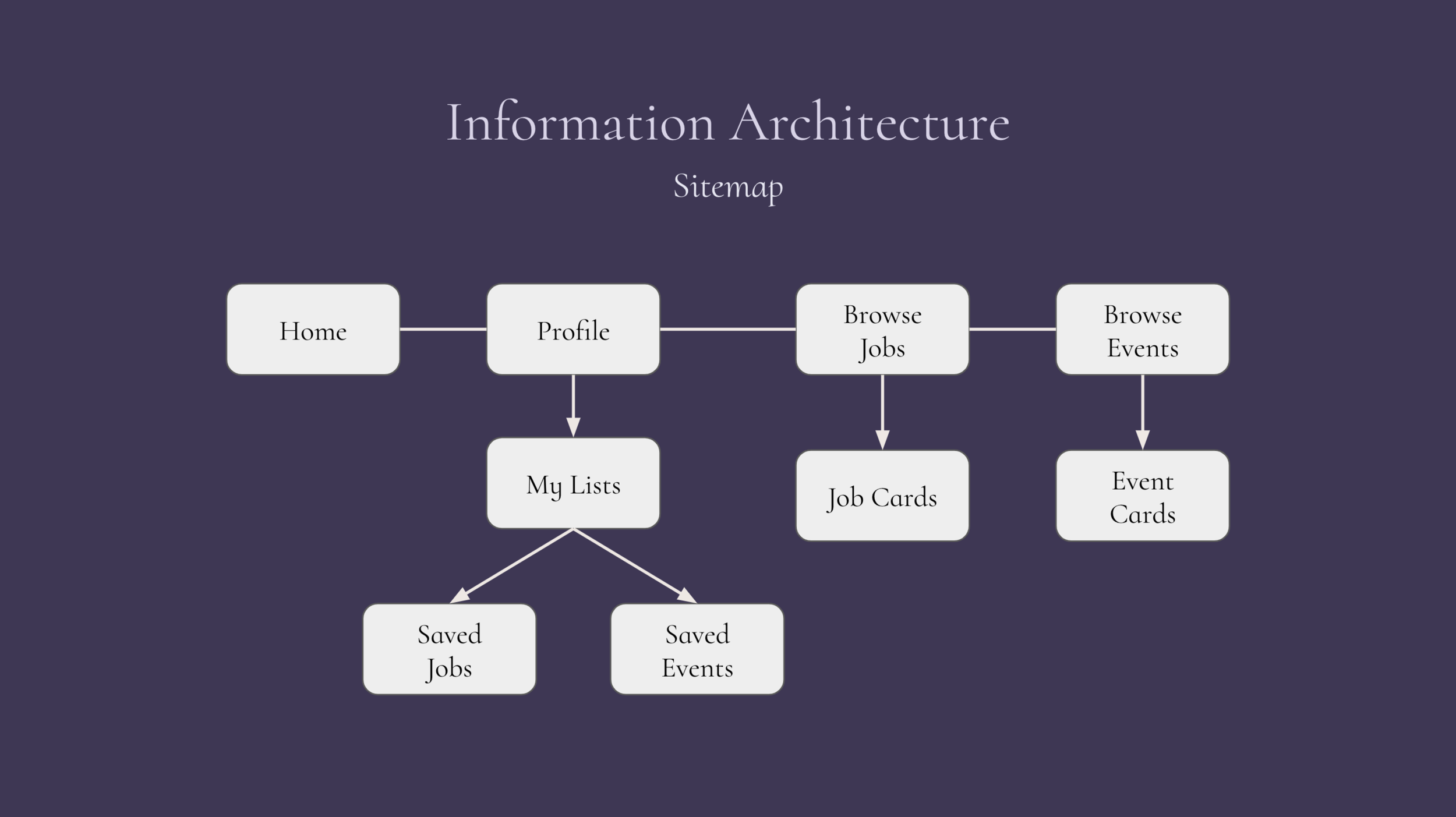
The majority of users grouped “Jobs” and “Events” separately and added “Lists” and “Saved” items under profile. The results of the card sort led us to organize our features into the following 4 major categories: Home, Profile, Browse Jobs, and Browse Events.
Sitemap
Wireframes
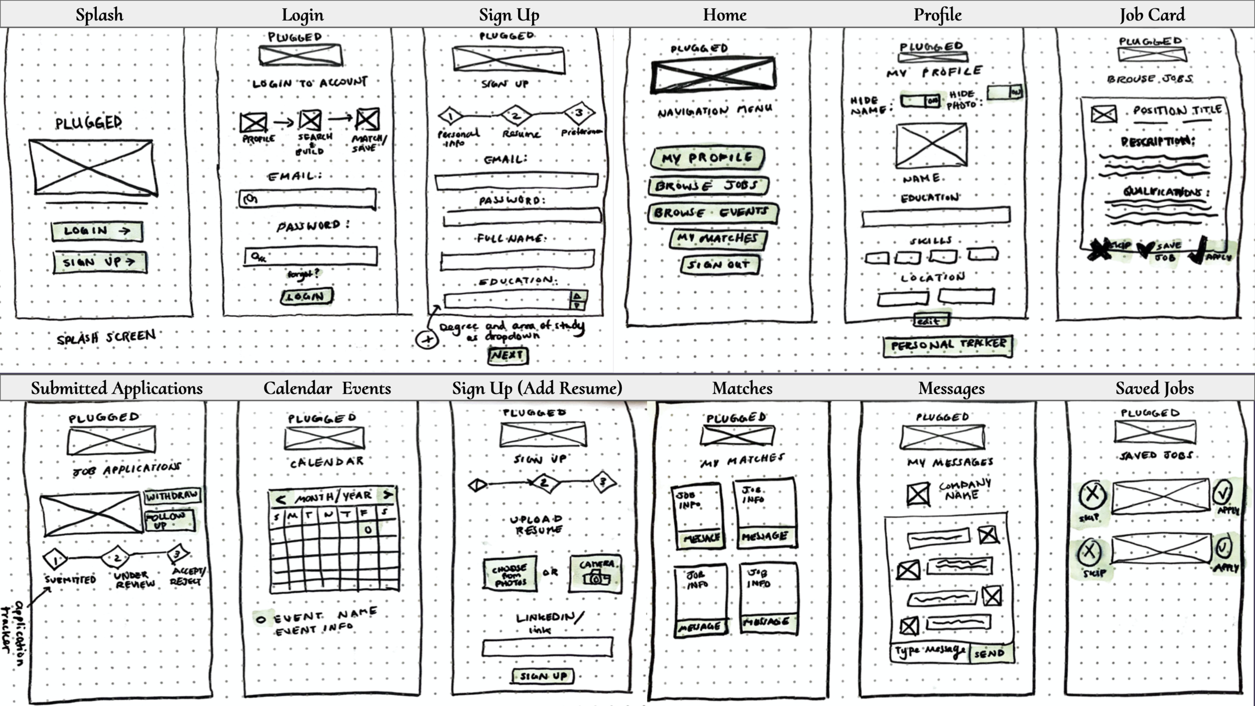
Using the key findings from our research and synthesis, our team decided to start sketching wireframes to begin the process of ideating our concept at the end of the first week. We checked in with each other along the process to share individual wireframes, concept sketches, and prototypes to eventually decide how to proceed with a collaborative higher-fidelity prototype.
Based off a quick design sprint at the start of the second week of the project, our UX design team set out to create individual prototypes for the concept in order to capture each of our findings and ideas, so that we could eventually come together to create a final MVP.
Individual Low-Fidelity Mockup
Concept Sketches for Plugged App
Individual High-Fidelity Prototype
Learning and using Axure to create a clickable hi-fi prototype
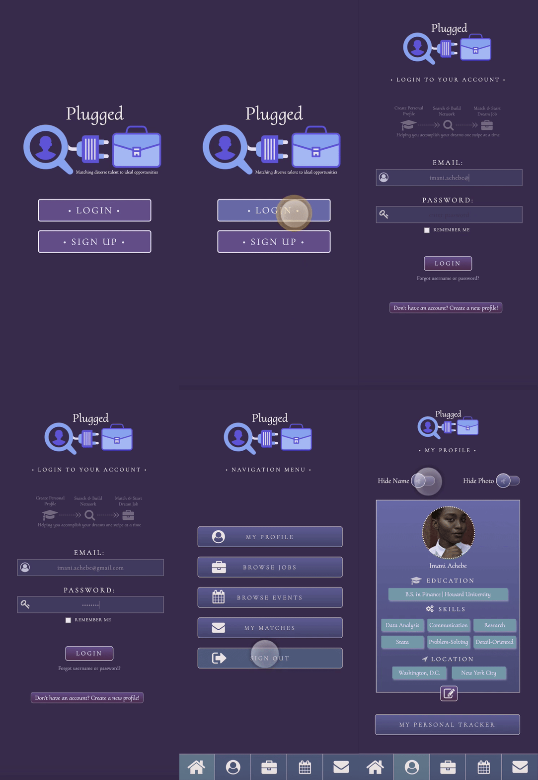
I spent the second week of the project learning how to use Axure to bring the concept to life. I began by coming up with a color palette and logo that fit the client’s goal. I chose icons for a job-searching user “plugged into” a briefcase icon to represent how the platform aims to connect diverse candidates to their dream jobs.
The hide name/photo toggle became one of the main features of my hi-fi prototype, since I wanted users to have to option to eliminate any implicit bias in the hiring process.
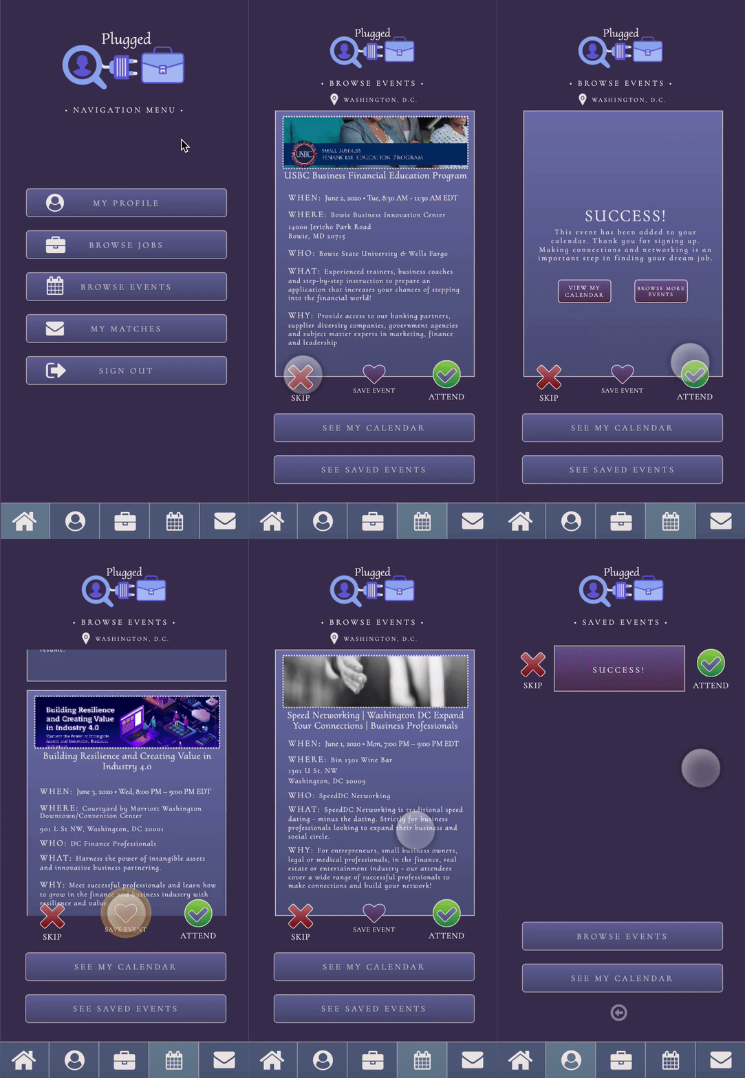
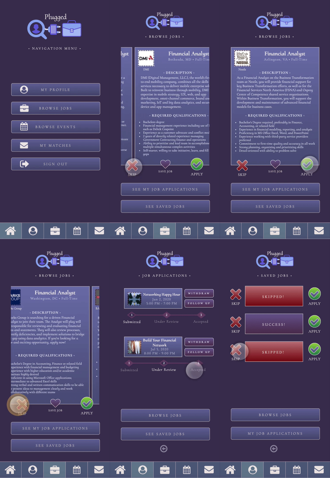
I also wanted to make sure the job and event cards highlighted the main information, so users could efficiently apply to a job or sign up for an event with just a swipe. I made sure to add a job application tracker, so users could keep tabs on the status of an application they submitted.
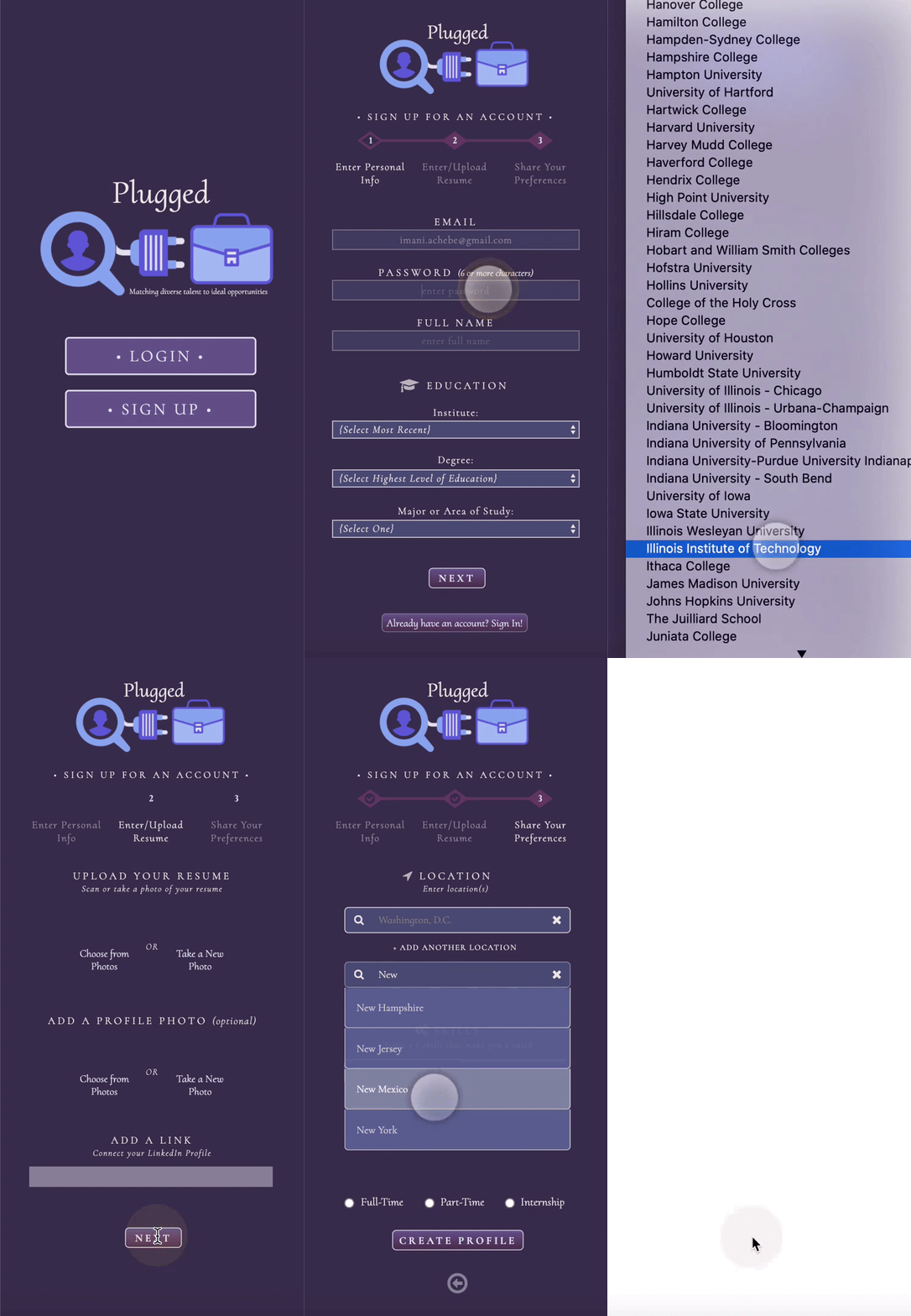
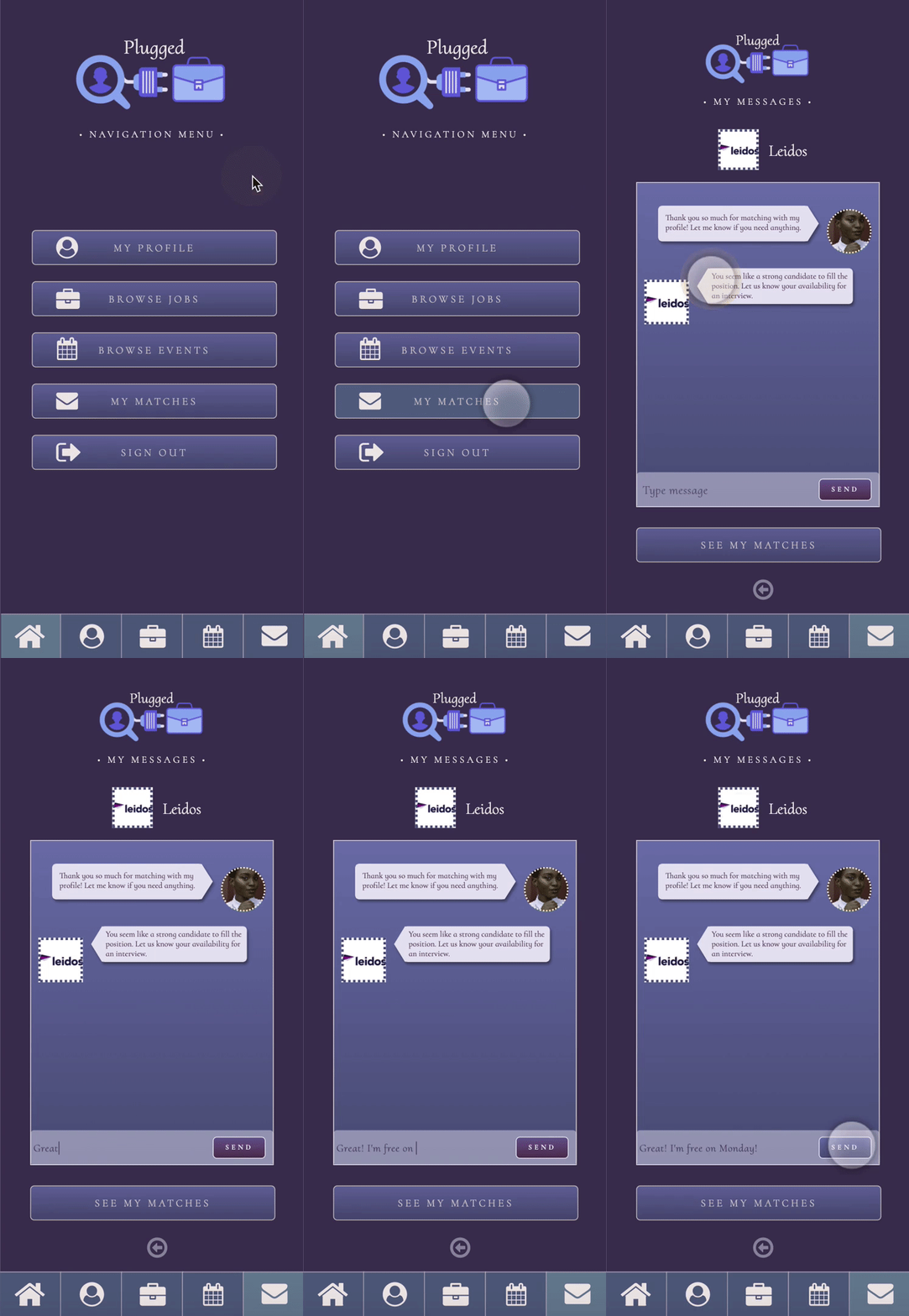
Here are some examples of flows within my individual hi-fi prototype:
Individual Prototype Demo Video
Conducting some individual informal usability tests on my individual prototype, I found that users had difficulty finding the personal tracker, job applications, and saved jobs/events. Based on those findings, our team prototype simplifies the lists under the profile into one page for applications and saved items, separated by the job and event categories.
TEAM HIGH-FIDELITY PROTOTYPE
Using Axure to create a high-fidelity prototype as a team
Once the team shared our individual prototypes, we took elements and features from each one to initially bring together a mid-fi prototype as a whole team to run usability tests on.
Based off my user interview findings and user personas, our team prototype included the hide name/photo feature, swipe-able job/event cards, and job tracker from my individual prototype.
Team Wireframes in Axure for Plugged App
Usability Testing & Iterations
Conducting informal usability tests to improve the MVP
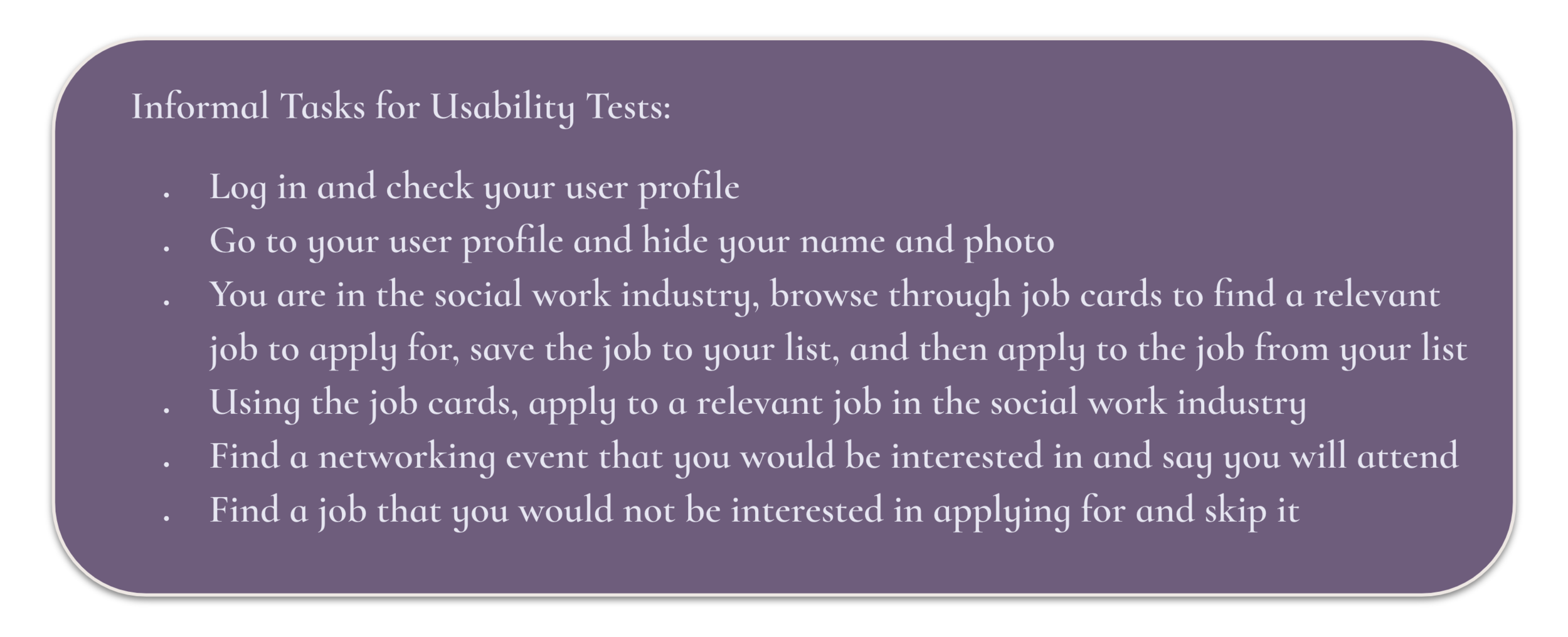
Using the mid-fi team prototype, we conducted a round of informal usability tests to ask for feedback on the usability of the platform and whether it accomplishes the goal of our project.
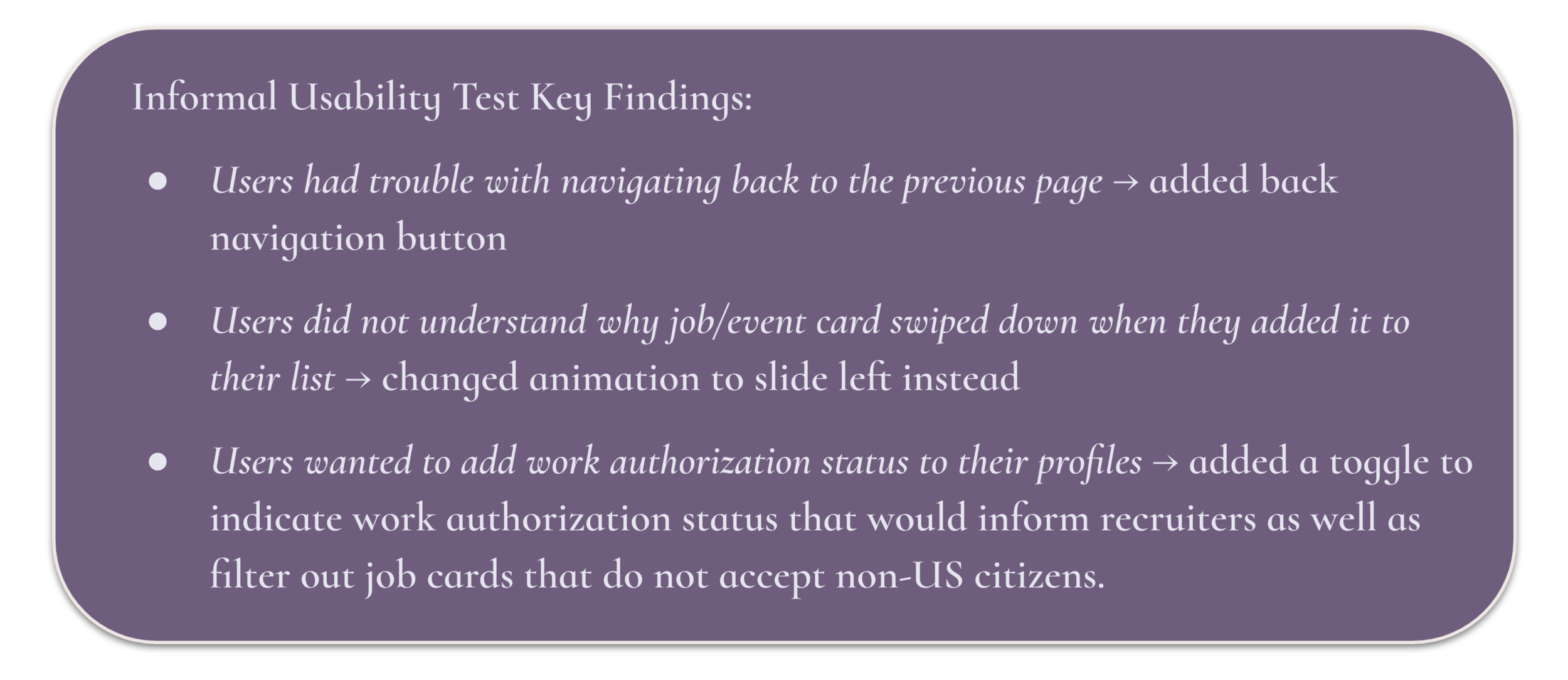
The informal usability testing yielded 3 key issues with the mid-fi prototype, so our team iterated on the final MVP to fix issues our users ran into while performing the informal tasks. The usability tests also confirmed that the information architecture and sitemap allowed users to complete all the assigned tasks efficiently without wasting time looking to find certain features.
Team High-Fidelity Prototype in Axure
CONCLUSIONS
Future recommendations & summary of UX work
As we completed the final MVP for Plugged, our team came up with the following recommendations for key features the platform could include in the future:
Add reminders, notifications, and a messaging feature to facilitate communication between users and recruiters
Follow up on job applications with messages and connections to specific hiring managers and companies seamlessly after submitting an application
Job application feedback (career experts help candidates create the best profiles)
Add a diversity score to company profiles to assess how well they recruit diverse candidates
Add a “recommend feature”
Use artificial intelligence to recruit diverse talent and connect them to companies around the world, so every candidate can find the right fit for them
Our team efforts brought together a wide range of research and concepts that ultimately allowed us to collaborate to create a comprehensive platform that targets user needs designed for a diverse community to facilitate their job search process. This tedious and overwhelming process hinders diverse talent from finding and connecting with the right opportunities, so a platform that targets diverse candidates to find their ideal job matches and events will not only help the individual candidates, but also the progress of the community as a whole, ultimately creating a more inclusive job market.


